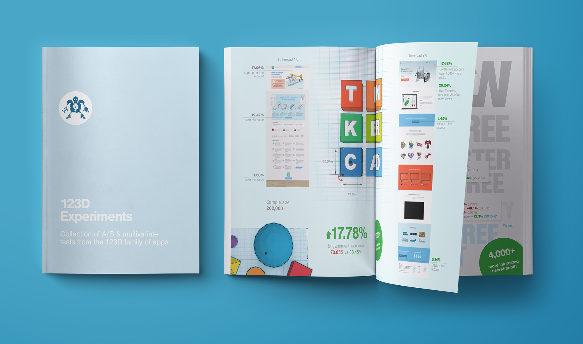
25,900% growth for Autodesk Tinkercad in 2 years.
Growing online community from 50k users to 13M+ via high quality content creation, clever marketing, and iterative design approach through testing.

Challenge
Mostly a B2B company with complex prosumer offering, Autodesk needed to expand their market share by entering the consumer world. With a series of strategic acquisitions, they grew their portfolio until this growth became troublesome. As a result they refocused their efforts on conqering the market via education industry and cloud-based apps.
Services provided:
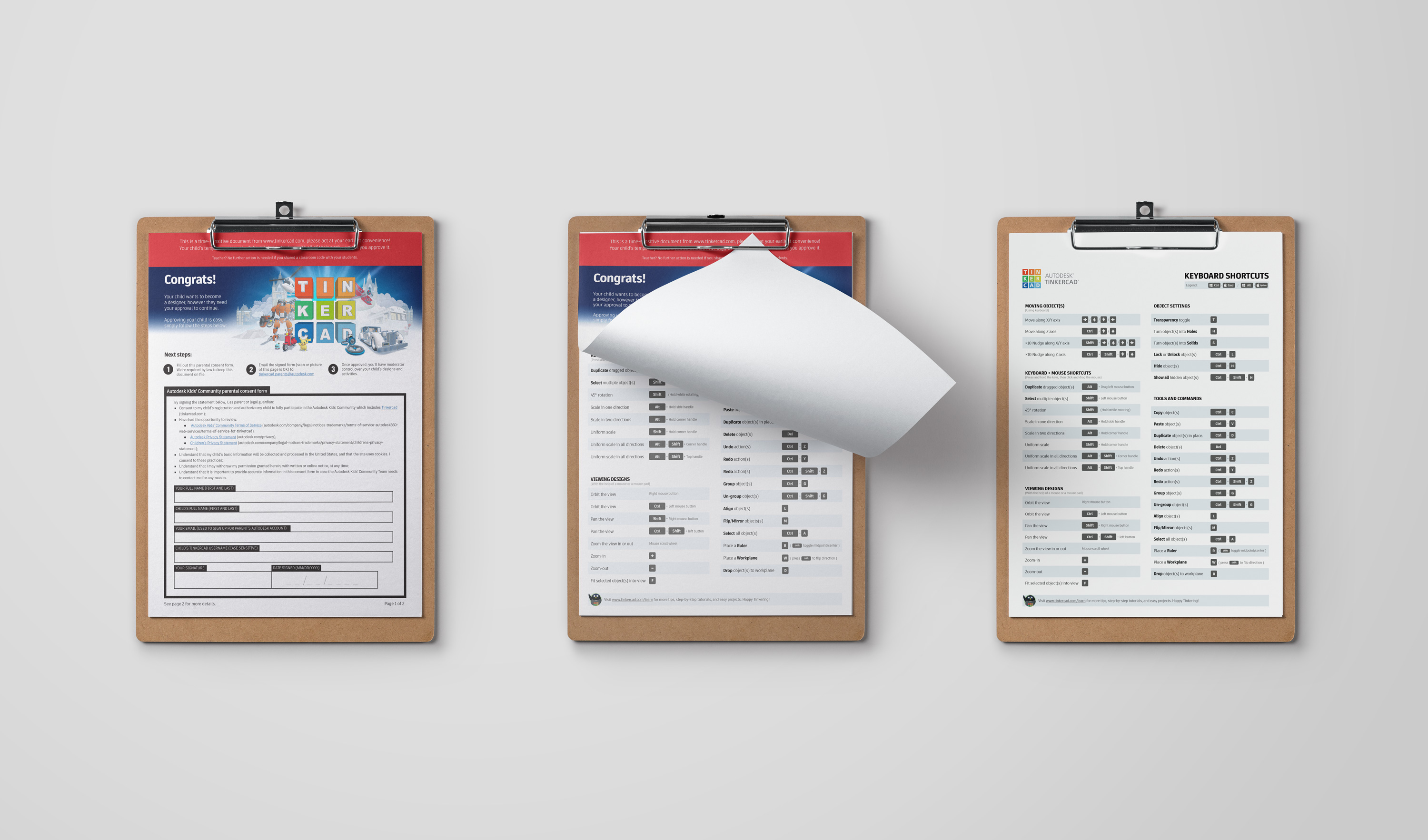
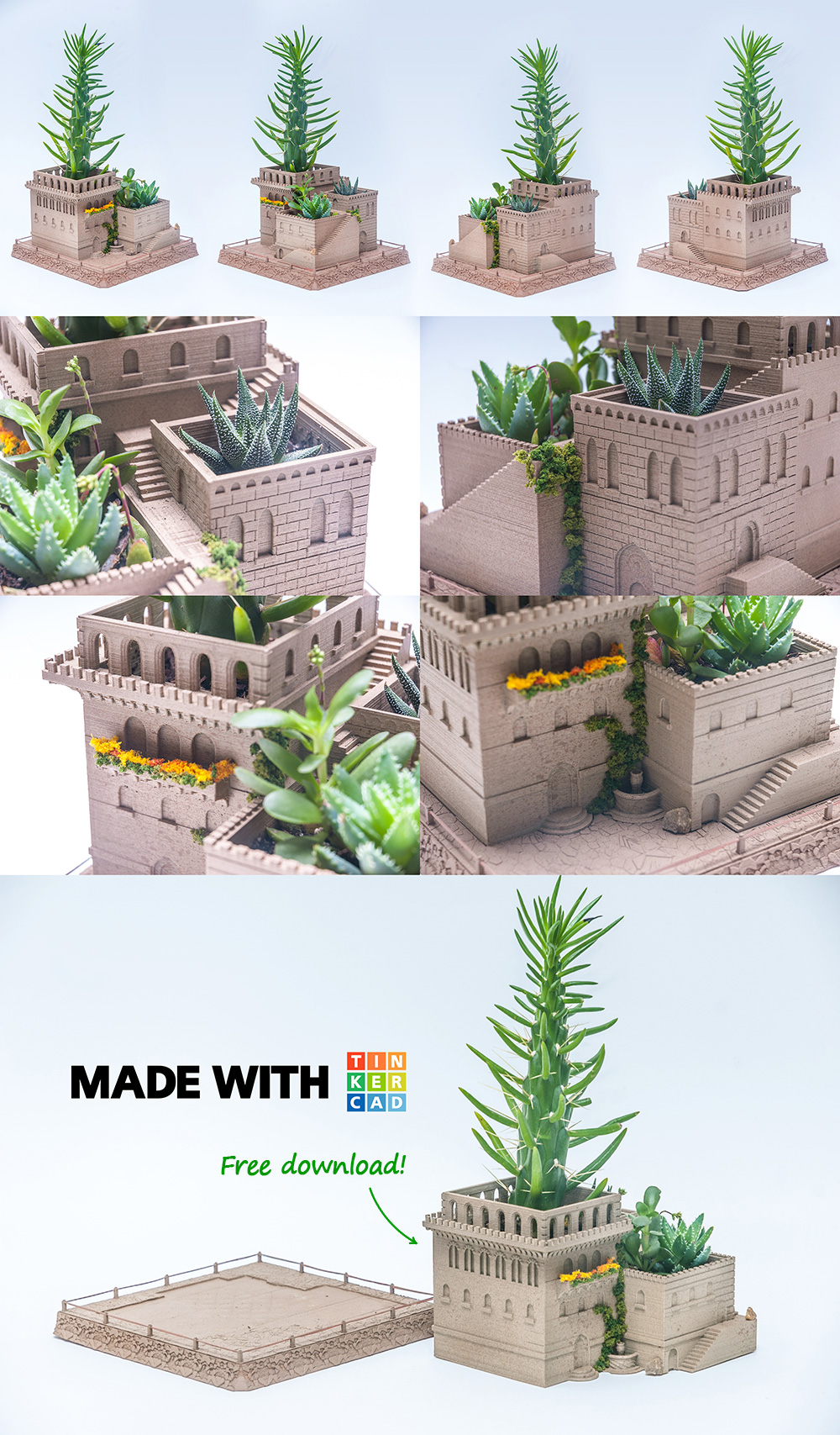
Branding, UX/UI design, visual design, web design, print design, content architecture, document design, content creation, front-end development, SEO, marketing, conversion optimization, writing, animation, photography,.
Solution
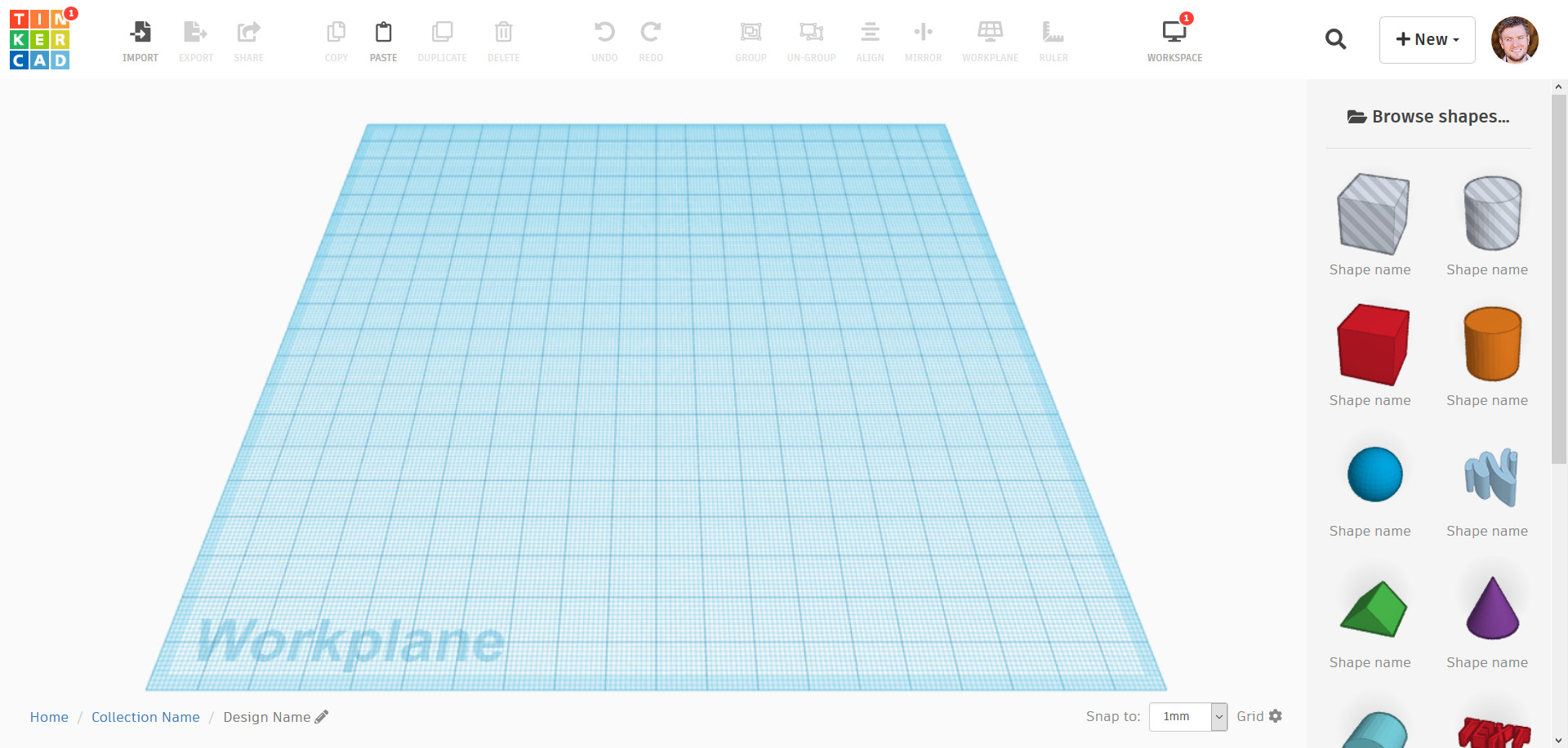
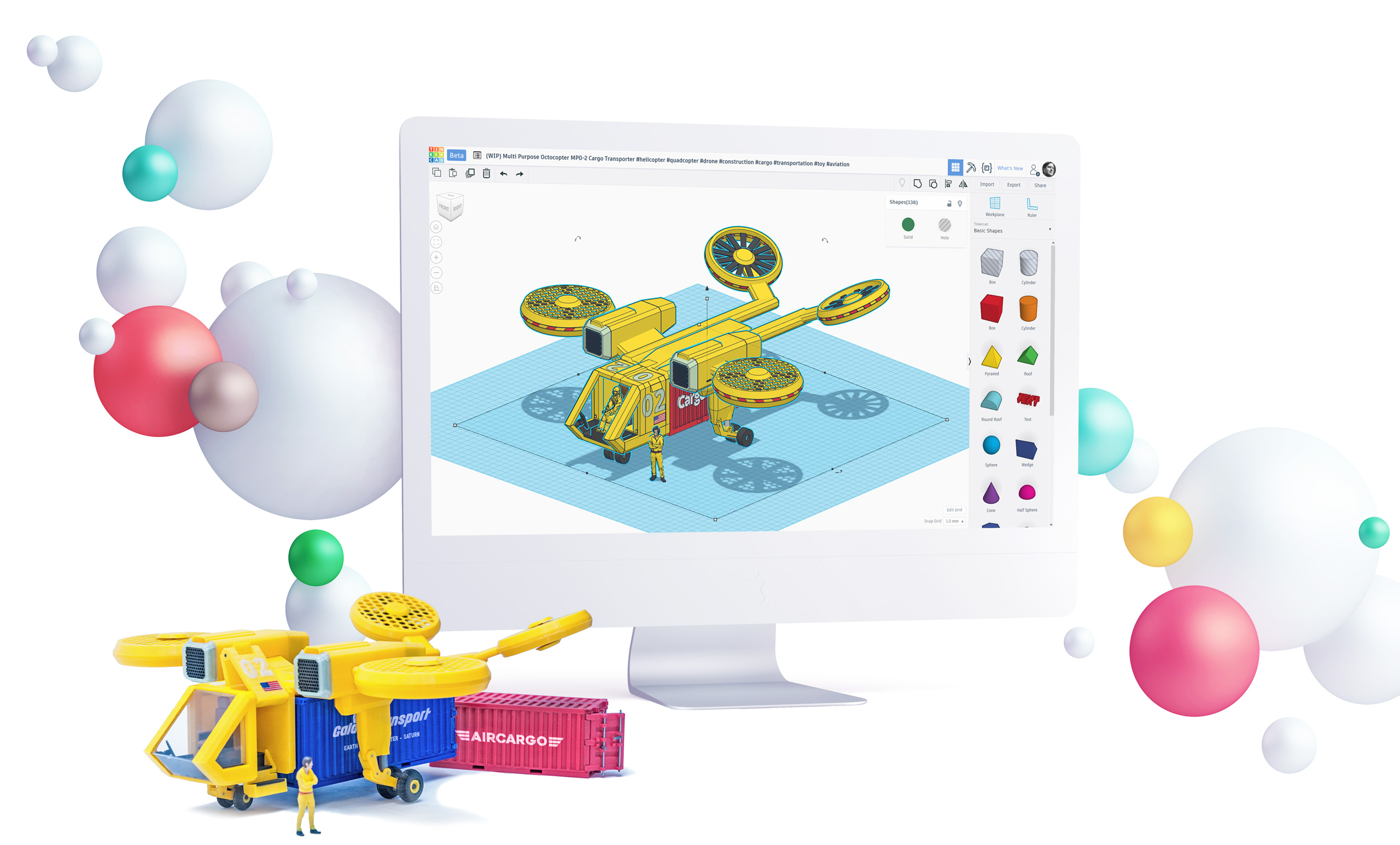
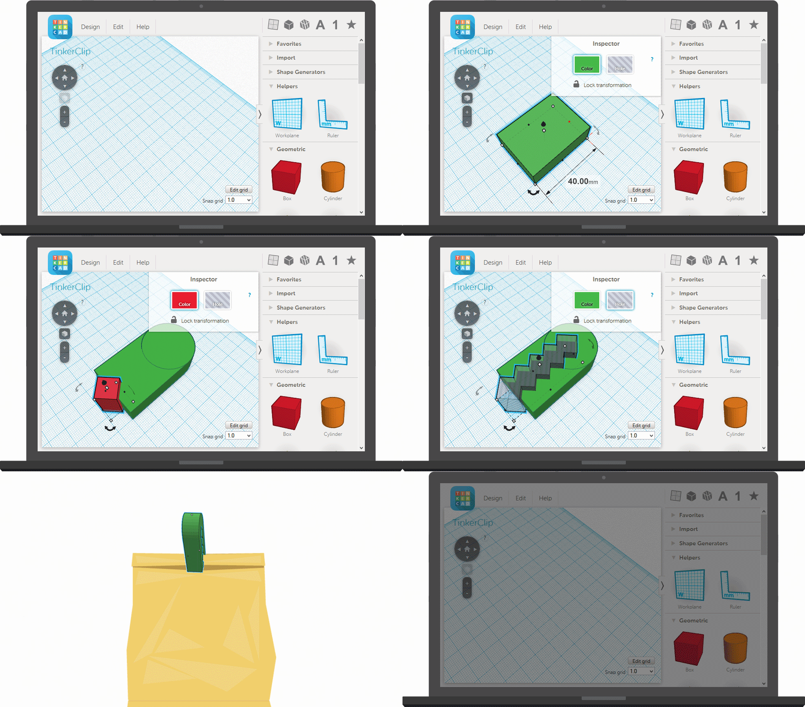
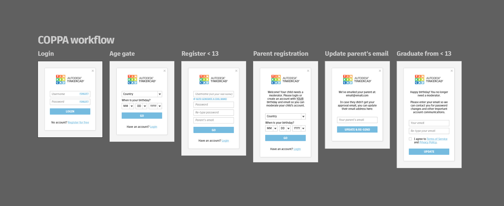
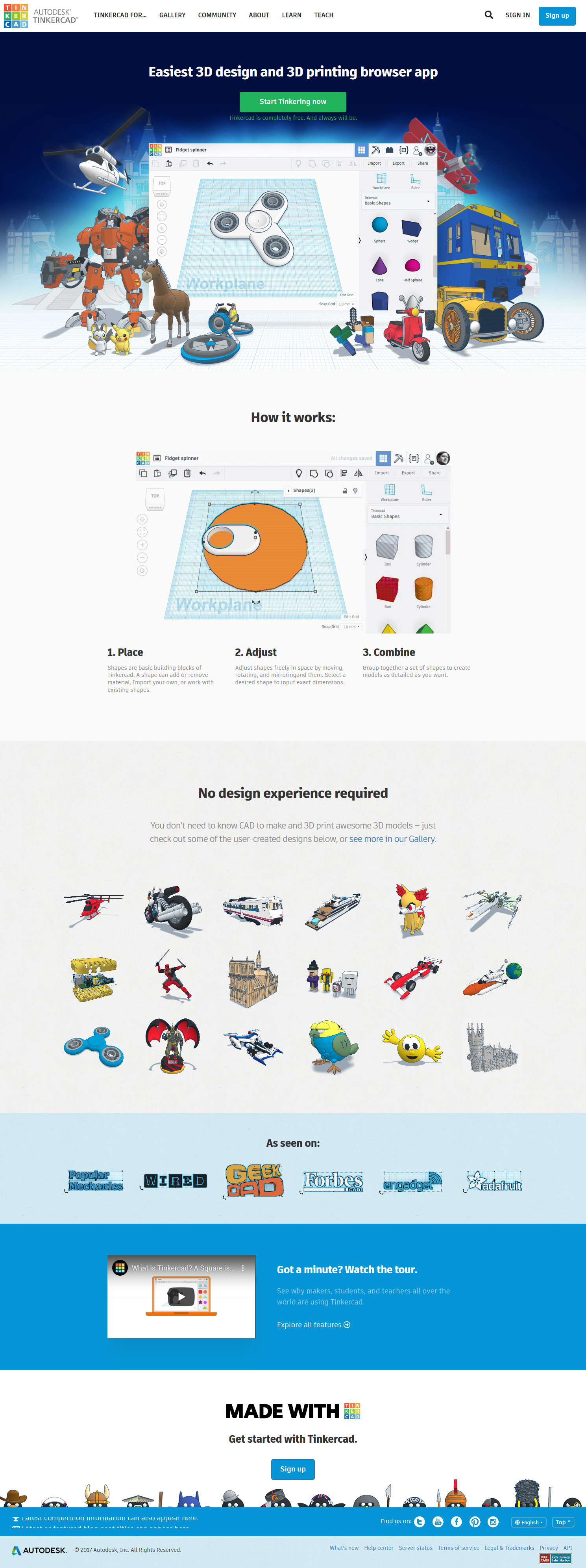
Idea was to make people want to use Autodesk's products, not have to. Playing up on the visially attractive [and memorable] UI design of Tinkercad, marketing was completely changed to better reprsent what the offering stands for while at the same time inspiring the future Tinkerers in ways previous presentation didn't.
- Complete website re-architecture.
- Selection of a front-end framework that would instill consistency; for this reason website was Bootstrapped.
- Determining benchmarks to compare any consecutive redesigns against.
- Update the marketing approach.


BETA
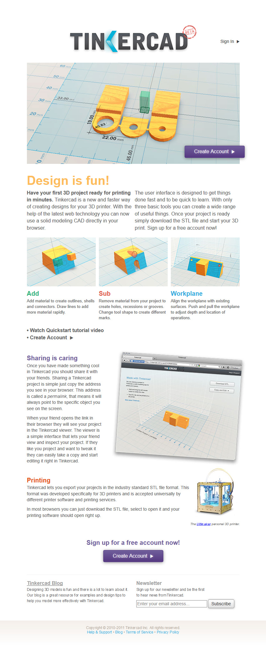
V1
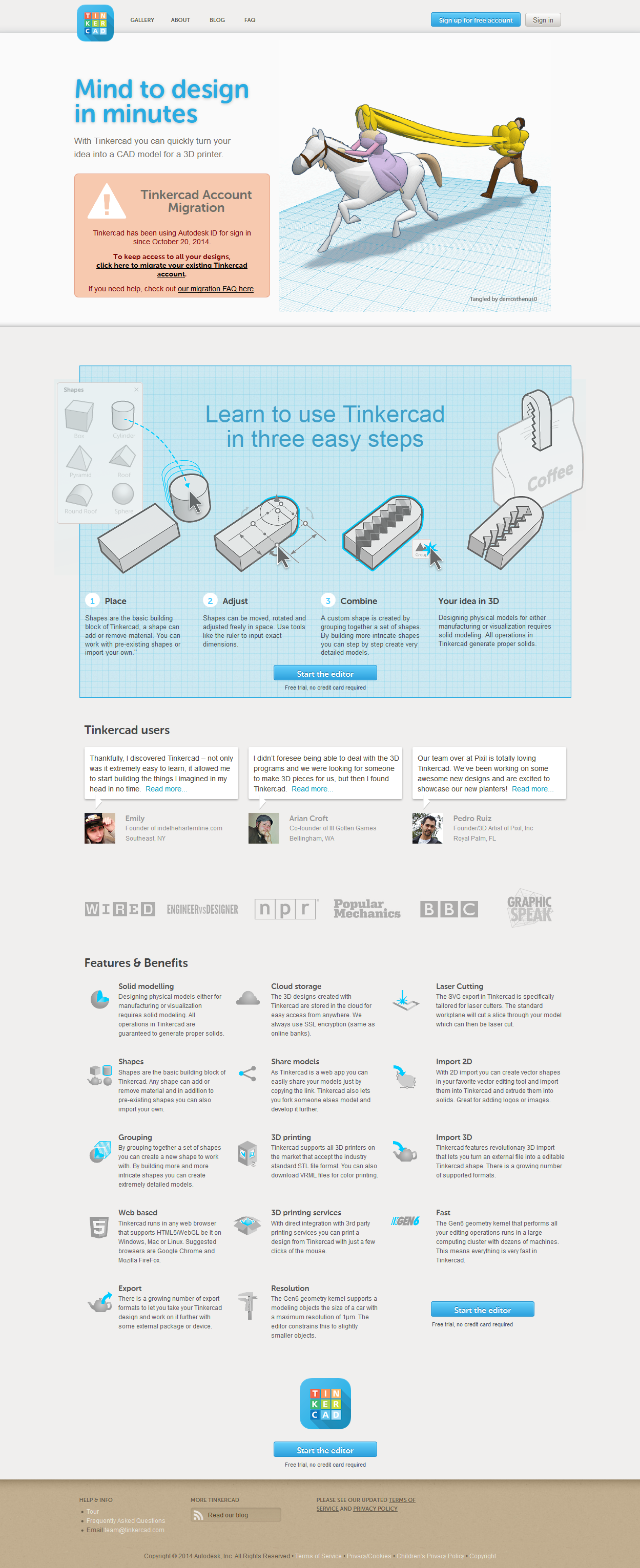
V2

V3.2
Result
Engagement went up by nearly 20%, from low 60's to high 80's. Userbase grew from 50k to 15+M (currently sitting at 35M+). Tinkercad is in a carriculum of every state in the nation, and is taught in all major education hubs across the world.

